The 21-year-old founder of Japanese Sorrows explains how narrative, clarity, and restraint drive his design language.
Eyitomi “Valentino” Okanlawon runs Japanese Sorrows as a tightly controlled studio. Every piece begins with a concept, is developed through personal reflection, and ends with a carefully directed editorial statement. At 21 years old, and still completing his senior year of college in New York, Okanlawon handles the brand’s creative process almost entirely alone.
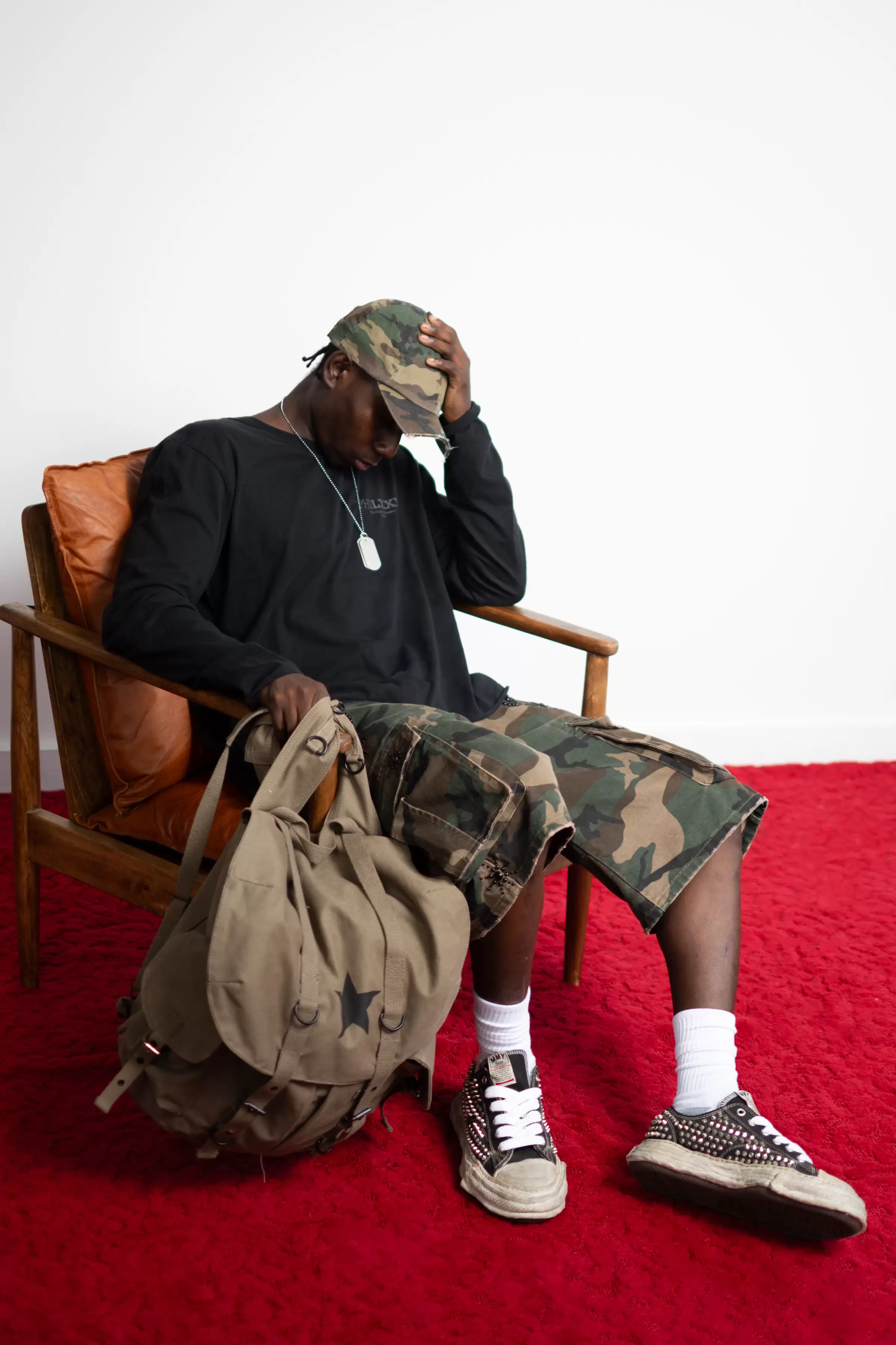
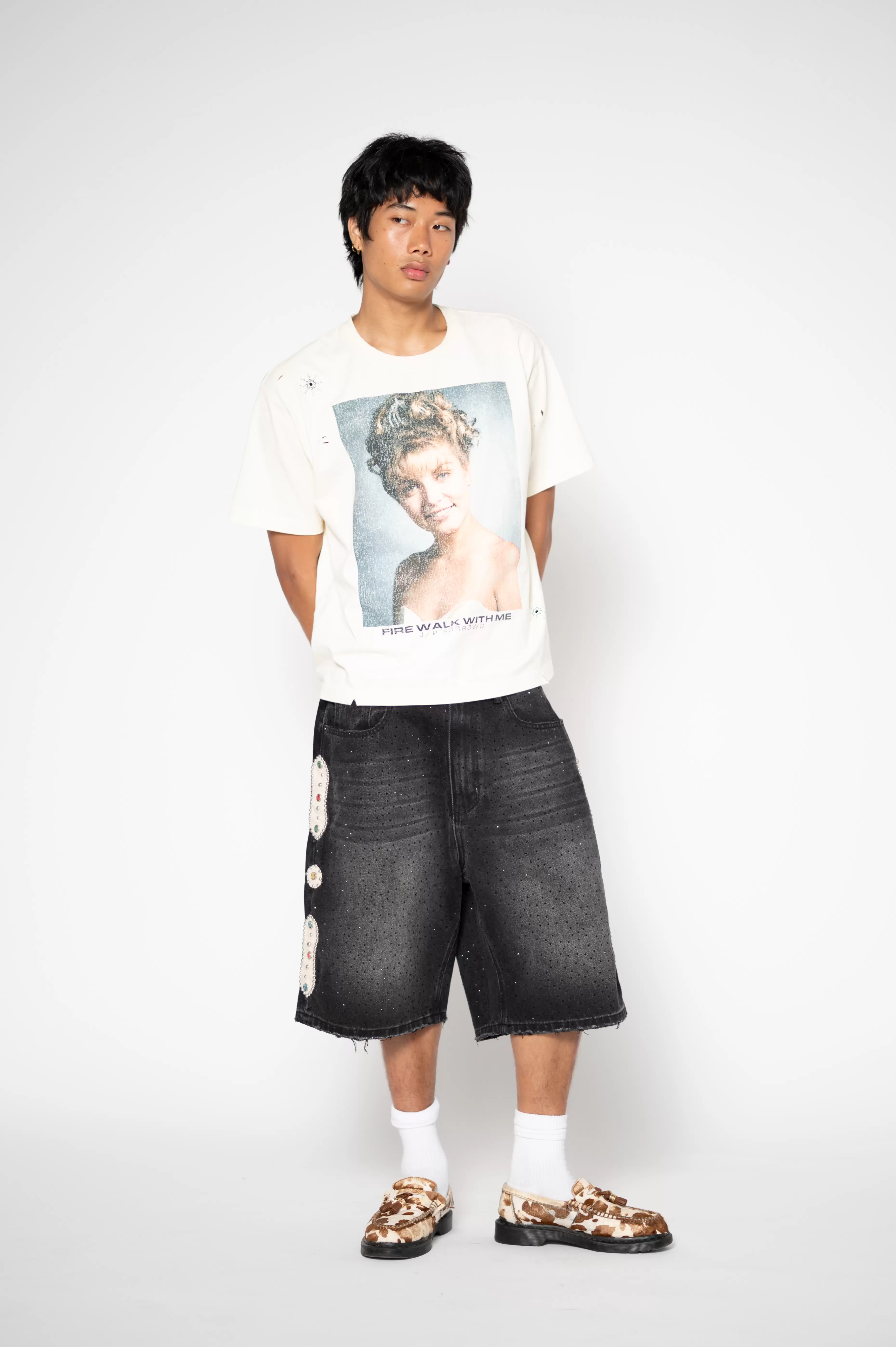
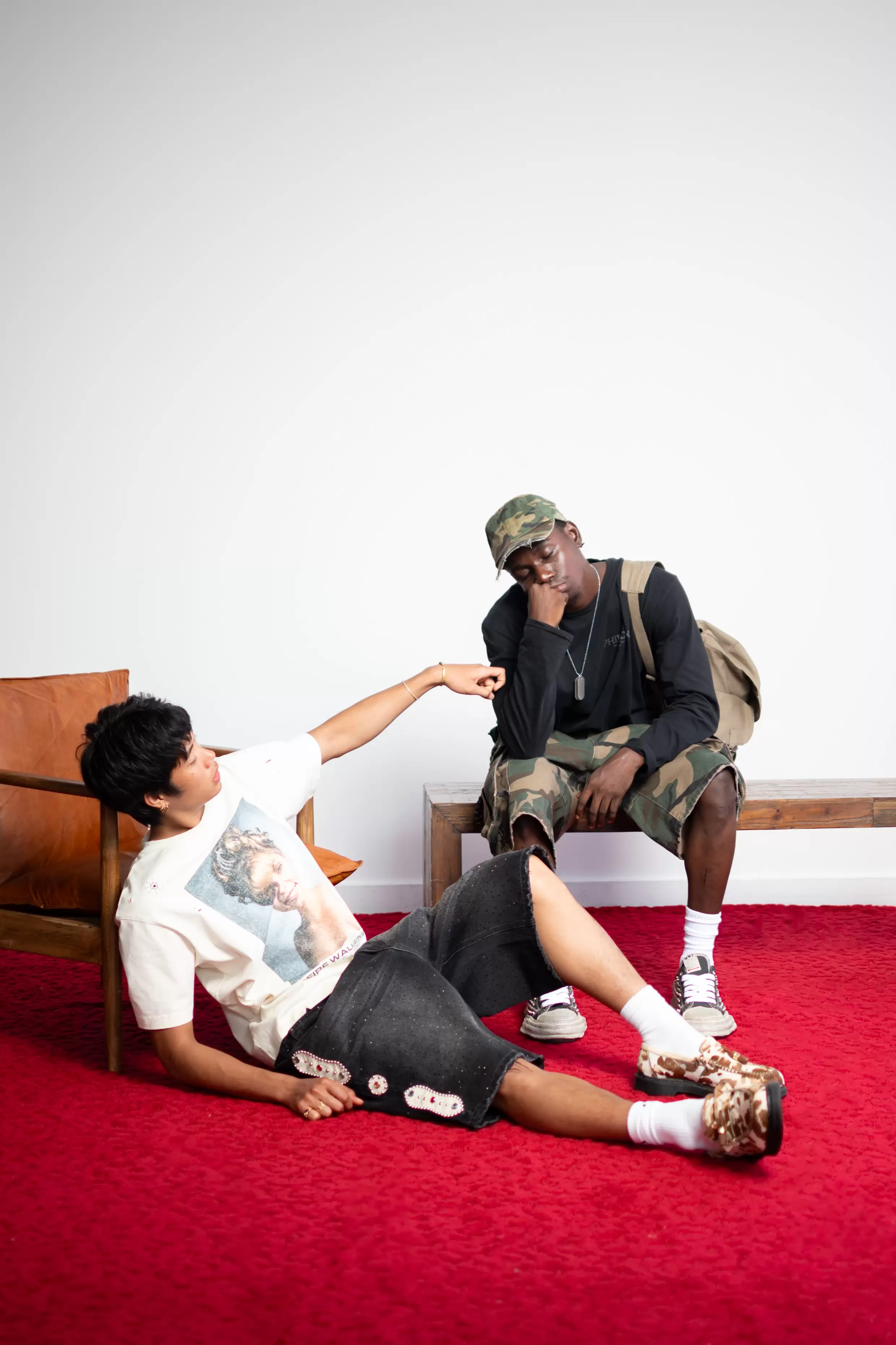
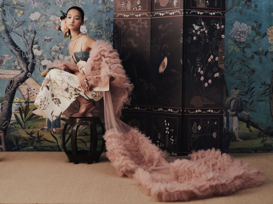
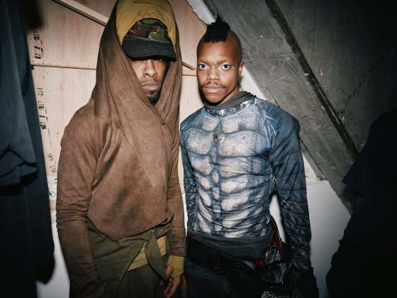
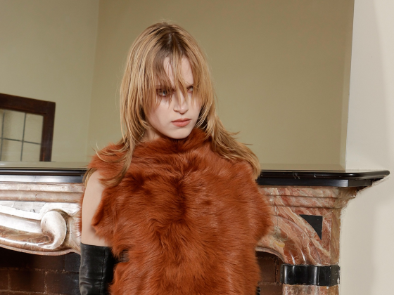
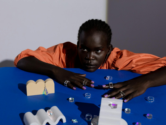
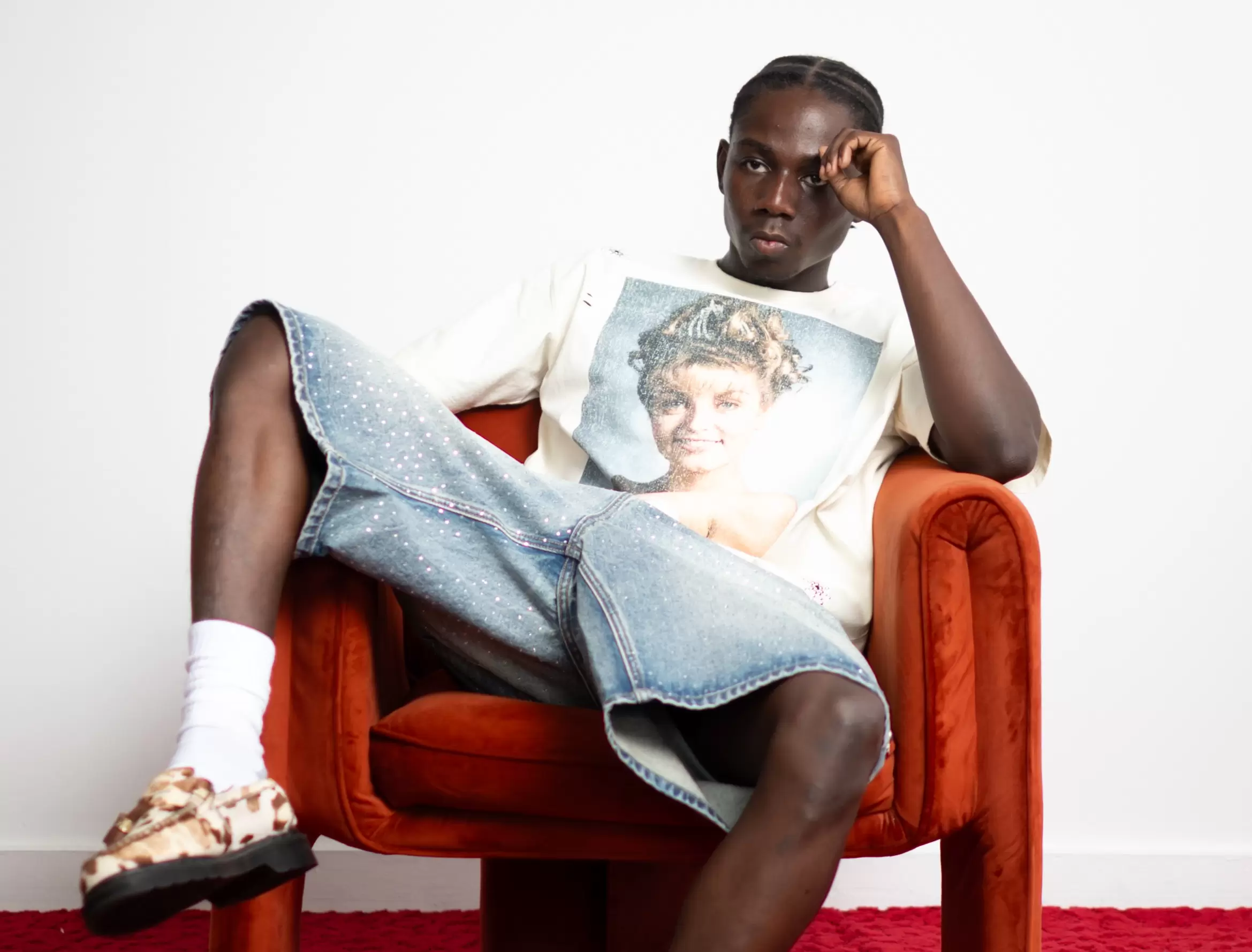
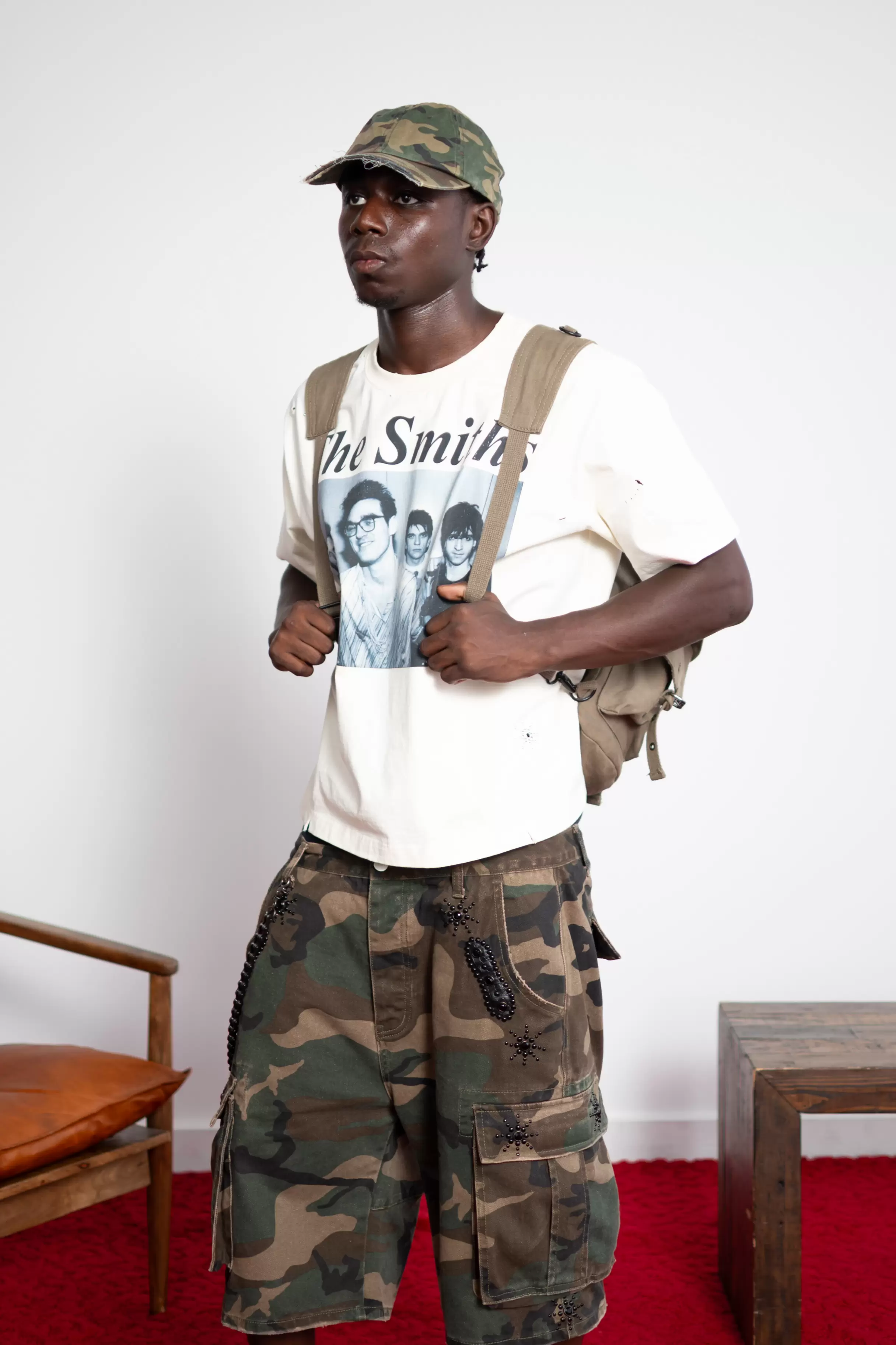
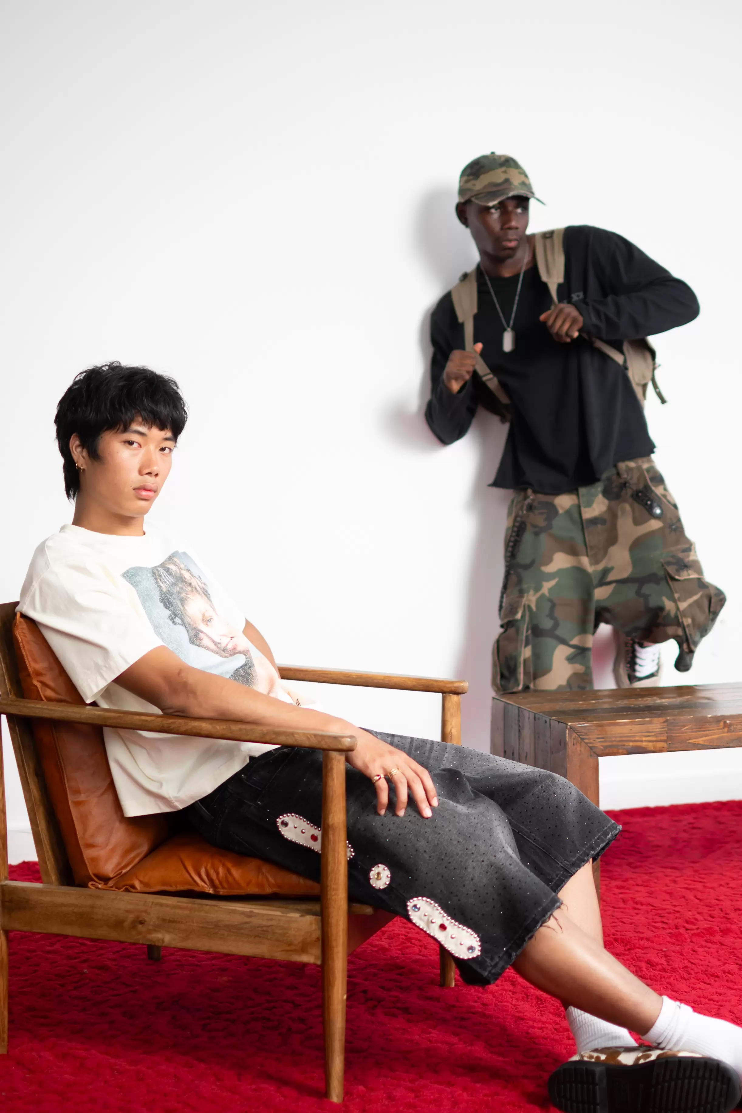
The label launched in July 2024 with a six-piece capsule titled Frolic, pairing camo, denim, and reworked vintage tees into a concise but emotionally weighted debut. Rather than building a collection around seasonal cues, Okanlawon works from feeling. Each body of work begins with a word; Ponder, Frolic, Glass, Hysteria, and expands from there. The garments follow the emotional tone set by the title, with embellishments acting as narrative markers rather than visual excess.
“Editorial pace is a rhythm led by emotion,” he says. “I design constantly, but only name things once the right feeling surfaces. Sometimes the garments and the title sit in tension. I like that. It feels human.”
“It came to me around 4 a.m., while I was visiting family in Nigeria,” he says. “There was a trigger. I have always been immersed in fashion. I designed, drew, learned sewing, and studied magazines and archives. I had been working on a brand called Vague Zele for about two years with three partners. It never launched, but those years were a necessary stepping stone. While visiting family in Nigeria, around 3 or 4 a.m., the name arrived. I was not searching for a new brand. Vague Zele was still my focus. Then it came to me: Japanese Sorrows. It felt delivered. I fell for it so deeply that it surpassed my attachment to Vague Zele. I started immediately.”
A Studio That Writes Before It Stitches
Japanese Sorrows isn’t seasonal. It’s narrative. Each drop is structured more like an issue or a short film than a fashion collection. Titles come first: Ponder, Frolic, and next, perhaps, Glass or Hysteria. From there, the clothes form themselves around a feeling. “Editorial pace is a rhythm led by emotion,” Valentino says. “I design constantly, but only name things once the right feeling surfaces. Sometimes the garments and the title sit in tension. I like that. It feels human.”
This approach also defines the visuals. In Frolic, that center was the Red Room. Not a passing Twin Peaks reference, but a formal element that Valentino intends to carry forward in future work.“Red isn’t a prop,” he says. “It’s the stage. It sets the tempo, holds the frame. It’s clarity, appetite, and a straight claim that the work is alive.”
A large part of Valentino’s method involves acknowledging his creative memory. The Smiths, Twin Peaks, Japanese archival fashion, these are less references than ingredients. The three reworked vintage tees in Frolic are homages, but none of them lean on nostalgia or graphics for easy recognition.
We asked him about materials like camo and denim. ” Denim is foundational for Japanese Sorrows. It is everyday life and durability. Camo was an experiment and a challenge. It let me test the brand’s language on a different surface. The result resonated. Camo and denim together create a soft and rugged contrast, which is reflected in Frolic. Some images are gentle, others are raw. That tension is human.
Doing It Alone — For Now
The New York-based designer is both the creative and editorial lead. He designs, styles, writes, and directs each project like it’s a publication. “I design everything myself, from concept to execution,” he explains. “Production is outsourced in Asia, but the creative stays in-house. I’m in school full-time, so it’s not always consistent, but I’ve kept the work focused and intimate.”
“The work is purely me,” he says. “I want you to feel like you know me through the images and the editorials before we ever meet.” That clarity, however, comes with its own set of demands. Okanlawon describes the photo shoots as even more rigorous than the design process itself, with every frame building on the initial brief. “From concept to execution, the intent is undiluted,” he says. He acknowledges that this kind of complete control has trade-offs. “Owning everything creates a through line that some might see as a lack of theme. For me, it is a personal continuity,” he explains. “The challenge is bandwidth. School limits travel and timing.”
Beyond time constraints, there’s the mental strain of maintaining such a closed loop. Okanlawon welcomes critique on design but avoids input on editorial work. “Editorials are statements of self,” he says. “The voice must remain mine.” That editorial voice—refined, structured, emotionally specific—has become a defining feature of Japanese Sorrows.
Influences and References
The label draws heavily from Japanese archival fashion, both in approach and tone. Okanlawon cites Number (N)ine, Undercover, Stereot Glamour, Kapital, and Yohji Yamamoto as formative influences, studied through magazines and lookbooks rather than seasonal collections.
“What we consume informs what we create,” he says. “Much of what I make today has roots in what I absorbed one to three years ago.” Contemporary references include designers and studios such as Sung Ju, Protocol Index, Sunday Off Club, Cost Per Kilo, Punch Drunk Parties, Surgery, Loading Room, Post Archive Faction, Hot Model Sex, Songaadon, Vuja De, Gatto 2025, and Michael J. Joon Kim. The full list, Okanlawon notes, is too long to name completely. But he sees influence as cumulative, something that reveals itself over time.
What Comes After Frolic
Following the debut capsule Frolic, Okanlawon plans to move away from traditional seasonal releases. “For growth, I plan to shift toward continuous drops while keeping the releases intentional” , he says. Editorials will remain part of the structure, functioning as time markers and personal statements.
The next project is titled Hysteria, which may appear in two parts. Another potential editorial, Glass, explores themes of reflection and mirroring. “I may lead with Glass. Nothing is set in stone yet.” What remains consistent is the studio’s focus on clarity, pace, and restraint. Japanese Sorrows does not aim to scale quickly or expand broadly. Its rhythm is personal, its structure tightly held.
As Okanlawon puts it: “The intimacy matters.”
You can view the collection on Japanese Sorrow’s website and follow them on their Instagram page.