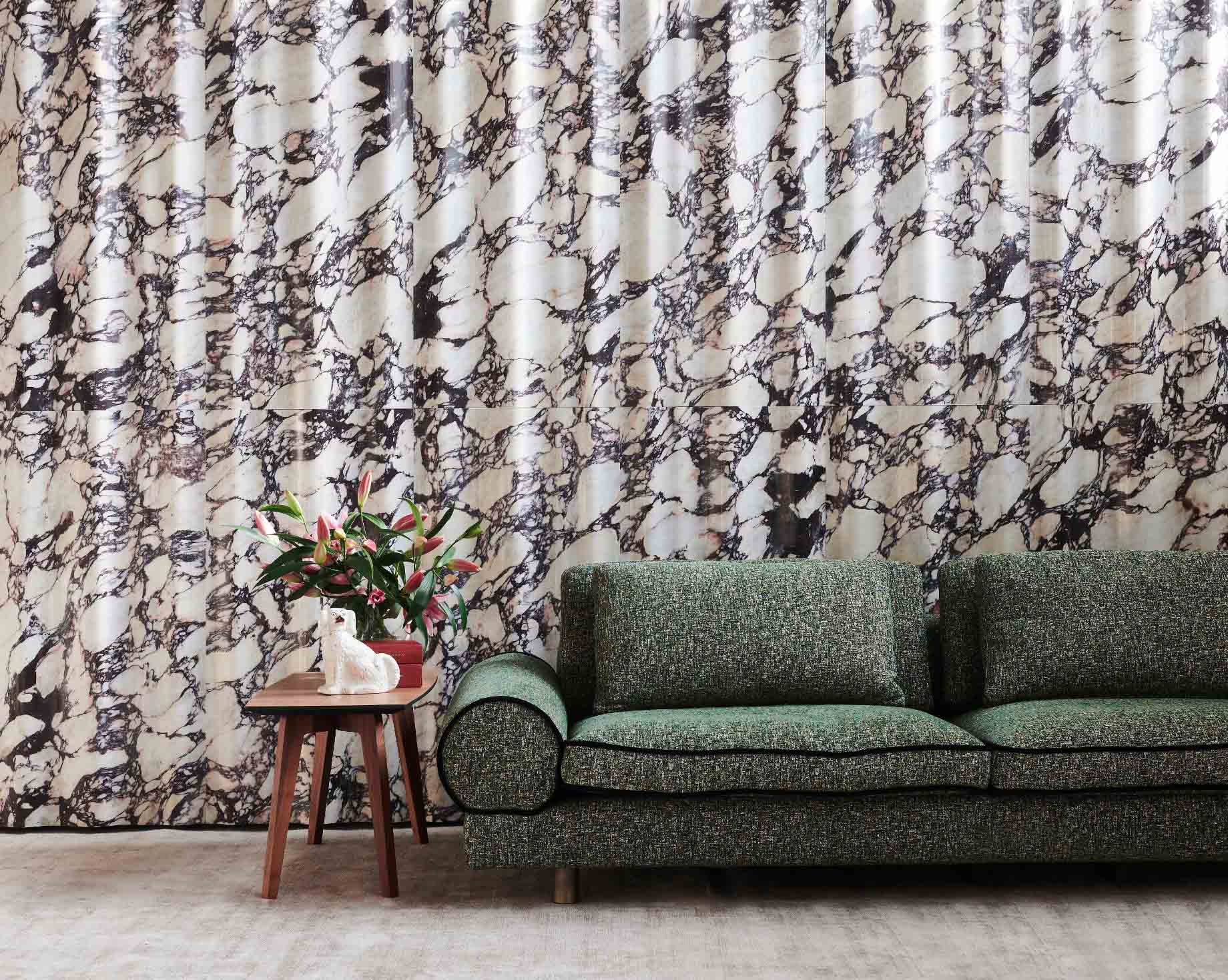
Stone is not the first material that comes to mind when the subject is drape. It is hard, cool to the touch, and heavy, and it has never fallen in folds. Yet in the catalog of Lithos Design, an Italian company based in Chiampo, near Vicenza, one collection is called Drappi di Pietra, literally drapes of stone, and its surfaces carry the names of fabrics: Foulard, Tulle, Chiffon. Elsewhere in the same catalog, there are surfaces called Plissé and Tartan. The names are a joke only up to a point. They describe what the eye does when it meets these walls. It reads them as cloth.
Texture is the new print
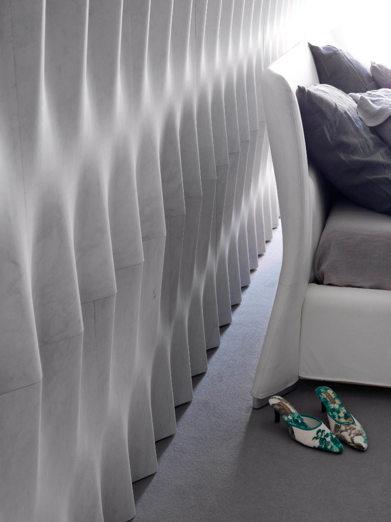
Anyone who dresses well knows that a plain garment can carry a whole look if its surface does the talking. A knit, a crepe, a pleated skirt in a single color: nothing printed, and still nothing flat. The same logic works on a wall. Surfaces shaped in relief rely on light rather than on pattern. They catch it on one side and throw shadow on the other, and the result shifts through the day as the room does.
Lithos Design presents its natural stone and marble wall coverings as interior surfaces with decorative three-dimensional patterns that play with light and shadow, and the Drappi di Pietra collection leans fully into that chiaroscuro. The pattern is not applied to the stone. It is the stone, shaped into folds that a printed surface could only imitate.
That distinction matters more than it seems. A print can be changed, painted over or fashionable for one season. A relief belongs to the wall, and it keeps working as the light moves across it.
Neutral rooms benefit most. In a monochrome outfit the eye lingers on weave and cut, because color has stepped aside. A pale stone wall works the same way: with color out of the picture, shadow becomes the pattern, and the room gains depth without adding a single object.
Cut, drape, pleat
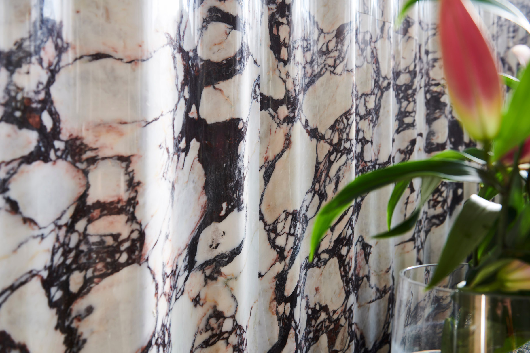
Behind the textile names, there is an industrial process. The company combines industrial design with natural stone to produce these walls, and it describes its production as sustainable, with close to zero material wastage. In a creative field that talks constantly about waste, a line that aims at almost no scrap is worth a mention, whatever the material.
The catalog is organized the way a pattern maker might organize a collection. Surfaces are sorted by character, linear, geometric, wavy, organic, and architectural, a vocabulary closer to the atelier than to the quarry. Each texture also comes in a palette of stones, so the same cut can be seen in a lighter or a deeper material, much as a single silhouette is offered in several colors.
The naming stays in the same register across the range. Vello is the Italian word for fleece, Favo means honeycomb, Fibra means fiber. Each name tells the buyer what to expect from the surface before a sample ever arrives.
The first choice, then, is not the stone but the gesture. Chiffon and Tartan are not the same idea, and they do not ask the same thing of a room.
How to wear it
The rule that works in a wardrobe works in a room. One strong piece, surrounded by quiet ones. A textured stone wall in an entrance, behind a bed or along a staircase can carry a space on its own, as long as the walls and furniture around it stay plain and the palette stays calm.
Natural materials sit well beside it. Wood, linen, and matte metal let the stone remain the one dramatic surface, and a rug or curtain in a similar tone keeps the room from feeling like a showroom.
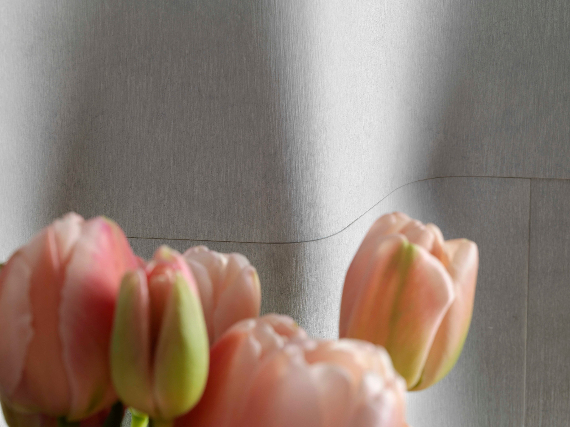
Light is the accessory. A window on one side, or a wall light placed close to the surface, will deepen the relief and make the folds legible. Flat overhead lighting will do the opposite and take the texture away. It is worth testing a sample under the lamps that will actually be used, much as one tries a jacket under the lights of a changing room.
Mood is the other decision. A linear surface tends to read as tailored and composed. A wavy or organic one feels softer and more relaxed, closer to a loose shirt than to a suit. Neither is better. They simply say different things in the same room.
A contradiction worth keeping
The idea is older than it looks. Italian sculptors have spent centuries persuading marble to behave like cloth. In Naples, the Veiled Christ completed by Giuseppe Sanmartino in 1753 lies under a shroud so thin that it seems to cling to the body beneath it, and the whole work comes from a single block of white marble. Visitors were so convinced by the veil that a legend grew around it, according to which the prince who commissioned the piece had turned real fabric into stone through alchemy. Nothing of the sort happened. It was craft, not chemistry. The stone was simply asked to do something it was not expected to do.
Wall coverings sit at the other end of that tradition. They are not unique works but surfaces designed to be repeated, produced with industrial methods and chosen from a catalog, much like a fabric swatch. Yet the contradiction is the same, and it explains why these surfaces hold the eye: a material associated with weight and permanence is shown at its most supple. A wall that resembles chiffon but is made of marble asks the viewer to keep two ideas in mind at once, soft and hard, light and heavy, and a room is more interesting for it.
Fashion has always understood this kind of tension. The garments people remember are rarely the ones that obey their fabric. They are the ones that push it a little, a stiff cloth made to flow, a soft one made to hold a line. Here the stone is the one being tailored. It keeps its weight and its origin, and it has simply been taught to hang differently. That is also why the names in the catalog matter. Calling a surface Foulard or Tulle is a way of admitting the contradiction rather than hiding it, and it gives anyone walking into the room a clue about how to look at the wall: not as a slab of rock, but as something that has been folded, pleated and hung with care, and that still weighs exactly what stone weighs. A small contradiction, and fashion has always done well with those.