Proto Marín’s Founder Spent Years Directing Videos for Def Jam. Now He’s Painting Swimwear.
Dominic Marín on trading fast-turnaround music visuals for a three-piece swim label built on Bauhaus discipline and hand-painted, garment-scale prints.
Before Proto Marín existed, Dominic Marín had already built a career most swimwear designers don’t have. Trained in digital arts and cinematic arts, he held early solo exhibitions as an abstract painter, then spent years as a creative director for Universal Music Group and Def Jam, shaping visuals for artists including Young Jeezy and DMX and contributing to Coming 2 America. Throughout that time, he was quietly sketching women’s swim silhouettes in notebooks he carried everywhere — years before the label was a plan.
Proto Marín launched with just three pieces. It is now heading into its first expanded collection, with a placement at Nordstrom and a growing reputation for prints drawn from biology rather than trend forecasts. In this interview, Marín discusses the influence of painters like Helen Frankenthaler on his approach to print placement, what a decade in fast-turnaround commercial work taught him about restraint, and how the brand plans to scale without loosening its production standards.

You had solo exhibitions as an abstract painter before you ever touched fashion. Do you think of Proto Marín as a continuation of that painting practice, or a completely different discipline?
A continuation. Abstract art taught me to trust intuition before there’s evidence for it and that’s the whole job now. There’s a comfort side: WGSN trend reports, cultural shifts, consumer sentiment. Calculated, and useful. Then there’s fear, which is realizing what you have is original, that it’s yours, and there’s no data behind it. Just a design expression tied to your journey. You execute it as well as you can without knowing if anyone will stop to notice.
I think it’s safe to assume that many artists that I idolize and have left an impression on us have dealt with this sort of dilemma. It comes with choosing artistry over commerce.
Practically, the painting hasn’t stopped, it moved onto fabric. I still work in abstraction rather than illustration, so a stingray becomes a color relationship and a line quality, not a picture of a stingray. Same decisions, different surface.
It was never about being a brand owner. Proto Marín is a school of thought, closer to Bauhaus than to a label. Considered, intentional, not fast, not competitive, just there for someone who sees what’s happening under the surface. You hang your child’s drawing on the refrigerator because a person made it, not a machine. That’s worth more than anything mass-produced.
What specifically did your time working in a global brand teach you about fashion?
Logistics. Overlapping calendars. Sourcing. Talking to factories. None of that occurred to me as an independent designer, I thought the job was the design. At a global brand you learn that getting the product right lives almost entirely in those details.
You learn to build a tech pack from the ground up, which is really learning to specify your own intent so a factory eight thousand miles away can execute it without you in the room. And you learn cost engineering, which is less romantic. A zipper comes off. Seam taping comes off. You sit with a garment and decide which construction details are the design and which ones you were just used to including, because the margin target doesn’t move. That’s a hard, useful exercise.
That knowledge felt guarded from the outside. From the inside it’s just how the machine runs, and seeing it reframed everything, I stopped designing and then figuring out how to make it and started designing with the logistics already in mind.
That’s what I brought to Proto Marín. Small label, same discipline.

You’ve named the tension between Helen Frankenthaler’s color-field intuition and Bauhaus discipline as the real logic behind the brand. How do you literally translate a Frankenthaler instinct into a swimsuit? Is it in color, in the cut, in how fabric moves?
Scale and placement. That’s the literal translation.
Frankenthaler’s paintings don’t work as motifs; you can’t crop one and keep it. The field runs off the edge of the canvas. Shrink it and you’ve destroyed it.
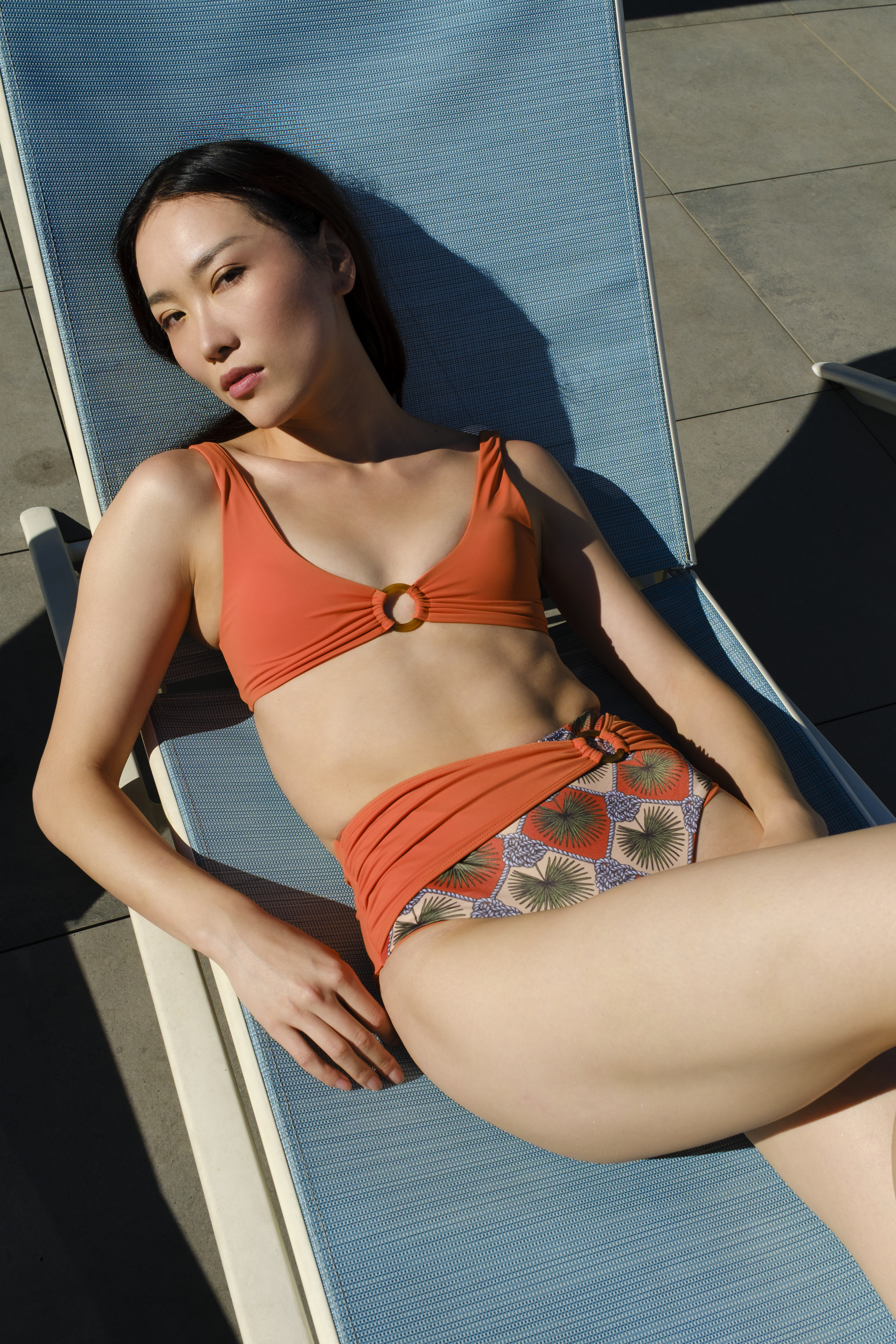
Most swimwear print is a repeat: a motif tiled across yardage, cut wherever the pattern pieces happen to fall, so the print is indifferent to the body wearing it. I treat the whole garment as one canvas instead. The composition is designed at the scale of the finished piece and placed deliberately, so a color mass sits where I decided it sits. Not tiled, composed.
The stingray print came out of seeing a black diamond ray. What stayed with me wasn’t the animal, it was the surface, the way the markings moved as one continuous form. So, the print isn’t a picture of a ray placed on a swimsuit. It’s scaled and positioned so the piece reads as a single skin, and the markings resolve across the body the way they did in the water. You should feel like you’re wearing something that belongs in the sea, not a graphic of it.
That’s where the discipline comes in, and it’s the Bauhaus half. Composing at garment scale means every size is a different composition, and it must hold across all of them. The engineering exists so the instinct survives production.
Frankenthaler, Richter, Basquiat, what they share isn’t looseness. It’s looseness under the control of a trained eye. Instinct in the field, discipline in the construction. The tension is the product.
The stingray print came from an actual animal’s markings, hand-painted before it touched fabric. Walk us through that process — do you work from photographs, from life, from memory?
From a photograph, but by ink first, not by screen.
I was at the National Zoo in DC on a date and stopped at a tank holding a black diamond stingray. I took one photo, said it could make a good print someday, and archived it. Weeks later, on a flight to visit family in Germany, I started hand painting it in ink from that photo. Only after the drawing existed on paper did it go into Illustrator.
That order matters. Ink doesn’t let you hedge, you commit to a mark and live with it, so the marks that survive are the ones that felt right rather than the ones that were accurate. What I was after was the rhythm of the markings, not the animal.
Then the factory, and placement took several rounds. The problem was the side seams. Because I compose at the scale of the finished garment rather than tiling a repeat, the composition must survive being cut apart and sewn back together, the print must read as continuous across a seam, on every size. That’s the unglamorous half, and it’s where the design either holds or falls apart. It mattered to me that it landed where I intended.
Are future prints going to keep coming from the natural world specifically, or was the stingray a one-off?
Yes, future prints will be inspired by the natural world and our surroundings. The stingray will never be a one-off.
You’ve directed visuals for Young Jeezy, DMX, and Coming 2 America under a very different creative identity. Working with major labels means fast turnarounds and big machines. How much of Proto Marín’s slowness is a direct reaction to that pace?
Honestly, not much of a reaction. Those lanes feel separate to me. One is commercial and fast, the other is craft. I got a lot out of both.
The fast one was a test of pressure and capacity. It’s not every day the VP of Marketing at Universal calls and says they need visuals for DMX’s celebration of life, to light up Barclays Center. You say, “no problem, when?” They say 3PM. It’s 11AM. That’s the job — can you do it, and can you do it well, in four hours. Working on that project with Swizz Beatz was the same lesson at a different scale: decide fast, commit, deliver.
What I took from it wasn’t a preference for speed. It was knowing I’m capable of it. That’s why Proto Marín’s pace isn’t a reaction to anything, if I were slow because I couldn’t move fast, that would be a limitation. I can move fast. Slowness here is a decision, because a print that must hold across every size at garment scale doesn’t get better under a four-hour clock. Different work, different clock.
Are you sourcing or treating fabric any differently because of the sustainability commitments, or is that more about production volume than material choice? With the new collection coming, how do you keep the “notebook” feeling – the slowness, the restraint – intact as more eyes and more scale enter the picture?
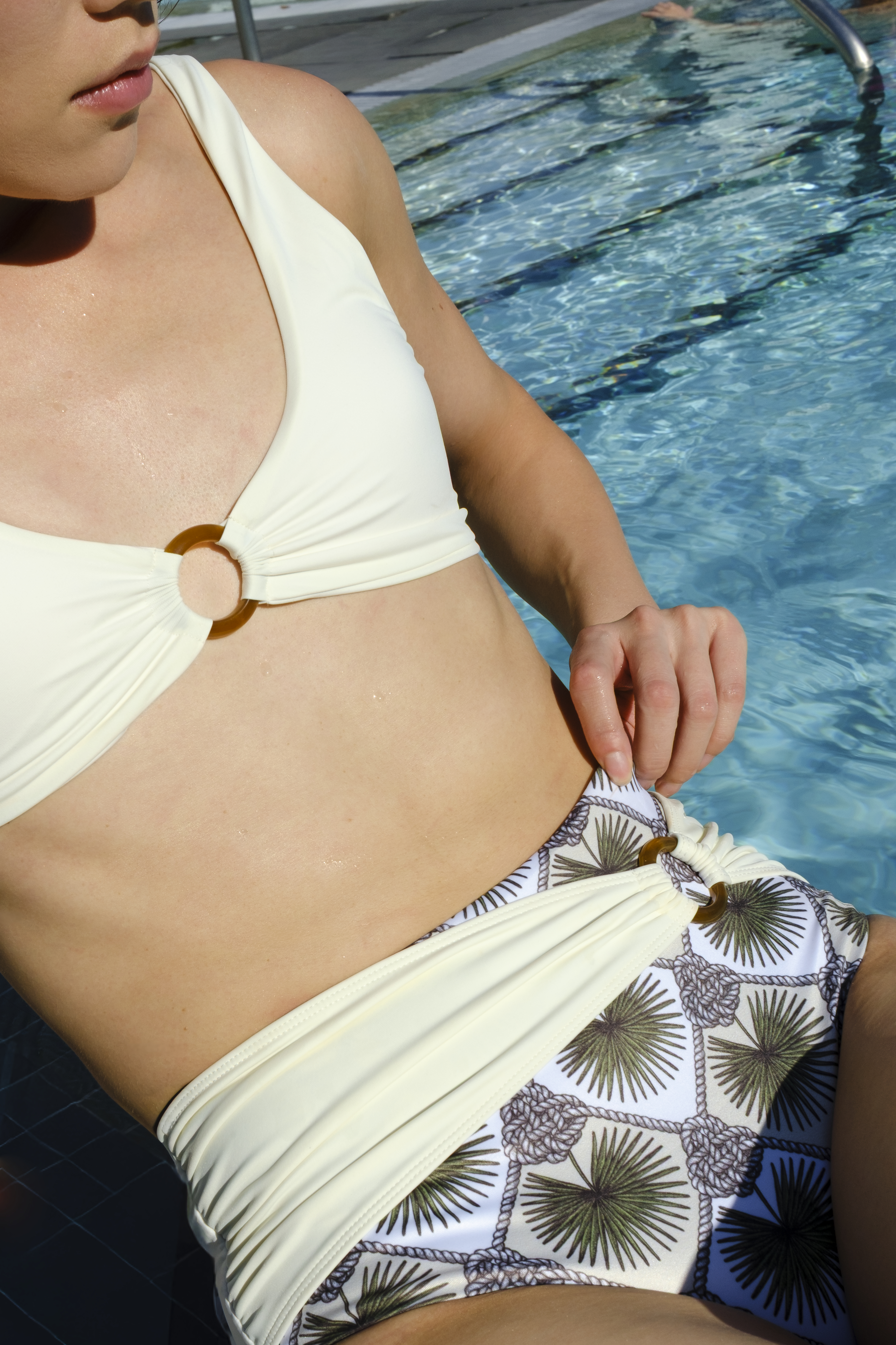
We chose sustainability at the material level, and the question is simple: what’s better for the planet? Practically, that meant Carvico Vita PL and Brisbane REC, an Italian mill, and both fabrics from recycled input rather than virgin fiber. We’re small. We can’t move the needle the way a global brand can, but we can make calculated choices even at a cost, and those fabrics cost more than the alternative.
What can you tell us about the new collection without giving too much away — is it an expansion or a new direction? Will the new collection still hold to the three-piece discipline, or is this the moment Proto Marín starts to grow in range?
Expansion, not a new direction. The range gets wider, but the ideas are continuous with what we’ve already shown.
The name accounts for that. Proto means first, a prototype is a first version that assumes there’s a next one. Evolution was built into the premise, so nothing is being redefined here. It’s the same thinking, further along.
What doesn’t grow is the tolerance. Every piece still gets composed at garment scale rather than tiled, which means every addition costs rounds with the factory before it earns its place. The range expands; the method doesn’t budge.